The Reading Edge Series
The reading edge is a fantastic and useful resource from the team at FontBureau, It contains a comprehensive guide for choosing the correct typeface for content heavy designs.
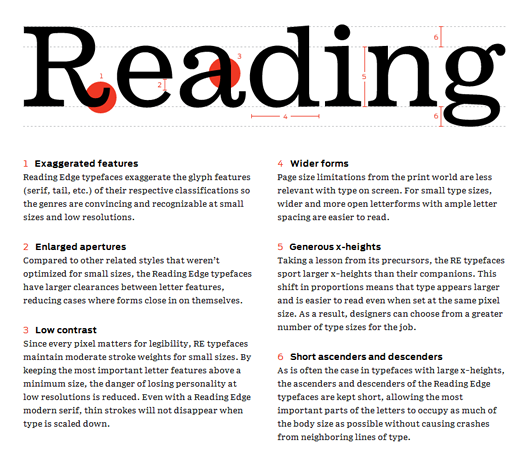
The limitations of today’s screen-based media impose many restrictions on web typography. Even if a designer understands these limitations, the large majority of typefaces available for web use were not designed for that purpose. Crafted with the same level of care as the rest of Font Bureau’s library, the Reading Edge™ (RE) series is a collection of web fonts that helps alleviate this tension between refined typography and the screen.
This gem of a resource also has some great examples of font combinations which is often a difficult choice for designers and typographers. Keep this one in your bookmarks — The Reading Edge Series